

In my opinion I believe that as a group we were extremely effective in our combination of our main product and ancillary texts. We were able to incorporate recurring themes throughout the different products creating a strong brand and band identity.
Syngery-'the interaction or cooperation of two or more organizations, substances, or other agents to produce a combined effect greater than the sum of their separate effects.'
Our main area of research focused around pop girl bands as they would be targeting the same market as us so would also have similar features and conventions. We focused predominately on new bands on the market as their campaigns would be the most up to date and modern. We chose to focus our main research on Stooshe and Little Mix as we believed that they were the most similar to us with the idea of creating a unique character and personality for each of the girls. Furthermore these two sites had a hevaily focus of social media. We knew that social media was going to be one of the main aspects of our website as that was a way of directly communicating with fans as well as creating a viral campaign.

One of our main sources of research was Stooshe. In many aspects Stooshe is relatively similar to our band as they are mainstream pop but with a touch of R'n'B whilst we are a pop band with a touch of rock.

Stooshe manage to create a strong brand between them, the website, album and their videos. Common themes run through each individual texts that combine them to them a brand.
We took different aspect from their marketing to have the same effect.
In their album, video and website their name is predominant throughout. It has a creative type face making it easily recognisable to their commercial fans. In the videos they also include their name to market to a new audience.
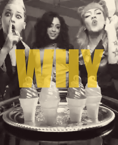
Furthermore in their 'Love Me' video they also start with a shot of the song name- this may encourage people to look at the album and website in order to purchase the single.
Bright colours are the main colour scheme of the group. Although there is no specific colour as such the general bright colours and intricate patterns are used to depict the band.
 Styling is one of the key synergistic elements used by this band. Whilst they don't all wear similar colours to unite them as a band they all wear different, but recognisable, costumes. Each band member wears different costumes/ outfits throughout the marketing campaign. This allows all the elements to relate to each other.
Furthermore in their 'Love Me' video they also start with a shot of the song name- this may encourage people to look at the album and website in order to purchase the single.
Bright colours are the main colour scheme of the group. Although there is no specific colour as such the general bright colours and intricate patterns are used to depict the band.
Styling is one of the key synergistic elements used by this band. Whilst they don't all wear similar colours to unite them as a band they all wear different, but recognisable, costumes. Each band member wears different costumes/ outfits throughout the marketing campaign. This allows all the elements to relate to each other.
Slide Show showing different aspects of the website
The Stooshe website is an example of well branded website. The theme of the website along with colouring and type face remain consistent throughout as well as with additional ancillary texts. The white background with black text boxed with splashes a pink creates a simple yet a effectively layout which allows the viewer to easily navigate around the website. The simple layout also allows the girls to stand out more widening their appeal.
The use of a photo linked with the different girls profiles is an effective way of introducing the audience to the different members of the band. The profiles allow the fans to become closer the girls helping the image of the band. This is also done via the live twitter feed on the homepage and dispersed social media links across the site. By including different forms of social media across the website it allows fans to access the band on many different media platforms. This helps to create buzz around the band through the viral nature of the social marketing websites.
A picture of the girls in the top corner of the server means that the audience will become more familiar with the band as well as creating synergy across the rest of the site.
 After remaking Little Mix's debut song last year we felt that this would be a very relevant case study.
 The synergy created in the Little Mix brand is very strong and allows their fan target audience to easily related simple pictures to individual band members. The advertising is simple yet effect. Each girl is given a simple logo which can be easily manufactured. However, these symbols give way to easy mass production of tops, bags ect...The Little mx symbol itself is on all the band's merchandise, videos and their website. The symbol is the first thing that is seen in their debut song 'Wings'. This means that to new fans they are automatically associated with their signature logo
The girls are given individual colours which helps the fans to recognise them easily. The pale colours are typically girly colours allowing them to further reach their target audience.
 The girls also have different individual styles which are heavily exaggerated in order to show different aspects of all the personalities

The Stooshe website is an example of well branded website. The theme of the website along with colouring and type face remain consistent throughout as well as with additional ancillary texts. The white background with black text boxed with splashes a pink creates a simple yet a effectively layout which allows the viewer to easily navigate around the website. The simple layout also allows the girls to stand out more widening their appeal.
The use of a photo linked with the different girls profiles is an effective way of introducing the audience to the different members of the band. The profiles allow the fans to become closer the girls helping the image of the band. This is also done via the live twitter feed on the homepage and dispersed social media links across the site. By including different forms of social media across the website it allows fans to access the band on many different media platforms. This helps to create buzz around the band through the viral nature of the social marketing websites.
A picture of the girls in the top corner of the server means that the audience will become more familiar with the band as well as creating synergy across the rest of the site.
The synergy created in the Little Mix brand is very strong and allows their fan target audience to easily related simple pictures to individual band members. The advertising is simple yet effect. Each girl is given a simple logo which can be easily manufactured. However, these symbols give way to easy mass production of tops, bags ect...The Little mx symbol itself is on all the band's merchandise, videos and their website. The symbol is the first thing that is seen in their debut song 'Wings'. This means that to new fans they are automatically associated with their signature logoThe girls are given individual colours which helps the fans to recognise them easily. The pale colours are typically girly colours allowing them to further reach their target audience.
The girls also have different individual styles which are heavily exaggerated in order to show different aspects of all the personalities
From our research we realised that logo and the name of the band were the most important features, in our eyes, to create synergy. We chose our name from the infamous saying 'All that glitters is not gold'. We chose to call our band All That Glitters as it will appeal directly to our primary audience of English teens who will be able to recognise the source of the name. Furthermore the initial name, ATG, gives a catchy feel to the brand an has the potential to become a household name like 1D and JB.
We needed the design of our name to be interested as that was the half of the focus of our album cover so needed to grab the audiences attention immediately. We used new media technologies, Photoshop, to create our brand typeface. We chose to rotate the R to make us stand out from the crowd. The name appears on every page of the website, twice on the album and at the end of the video.


Controversially we chose not to have a signature logo as we felt this has become a predictable trend with all new artists. However, with fashion become a bigger part of society we hose to make our look the logo. We incorporated our name into our look to came up with glitter on our faces. The look was simple yet effective. The focus on fashion appeals to one of the qualities we expect our primary audience to hold so makes us appear more desirable. Furthermore it also allows room for clear marketing strategies such as the sale of body glitter. The album name is 'good as gold' with ties in with our constant glitter theme. The positioning in the video, websites, album and photo shows is always Emily in the middle-me on the right- Alicia on the left. We did this so it is easier for the fans to recognise the individual members and have a regular theme running throughout
Looking back I am please with how we used synergistic marketing strategies to create a strong brand. However in hindsight I felt we could have done more to create a more effective marketing brand like Little Mix. I feel we should have created a brand logo that could be easily mass produced to create a connection between us and our products. In addition we didn't secure a strong colour scheme. Whilst the basic colours were gold, white, black and pink throughout the video and ancillary texts the shades all vary slighting making them feel like separate products rather than a brand. I feel that with the brand we currently own and with the small improvements we would be able to create stronger brand that is easily accessible!
No comments:
Post a Comment