Digipak

ALBUM DIGIPAK

cover

cover

website

WEBSITE -Click on the photo below to be taken directly to the All That Glitters website

Website

musvid

MUSIC VIDEO

Video

Showing posts with label Olivia Evaluation. Show all posts

Friday, 24 January 2014

Q1 In what ways does your media product use, develop or challenge forms and conventions of real media products?

In what ways does your media product use, develop or challenge forms and conventions of real media products?
For this project we created the new pop girl band-All That Glitter. There new album 'All that glitters in not gold' features the new single 'No Sleep Tonight'. For the video we chose to parody different genres such as country, boy-band, rock and grunge. It is set in the style of someone flicking through the TV channels before the TV breaks. We included different intertextual references such as the MTV sign and signature boy-band dance routine in order to appeal to a new fan base. Furthermore we finished the video we an adapted test screen showing All That Glitters.

Music Video
In our music video we were able to incorporate traditional and conventional forms as well as being able to challenge them particularly in relation to gender roles and women's involvement in satirical music videos.

Parody Videos
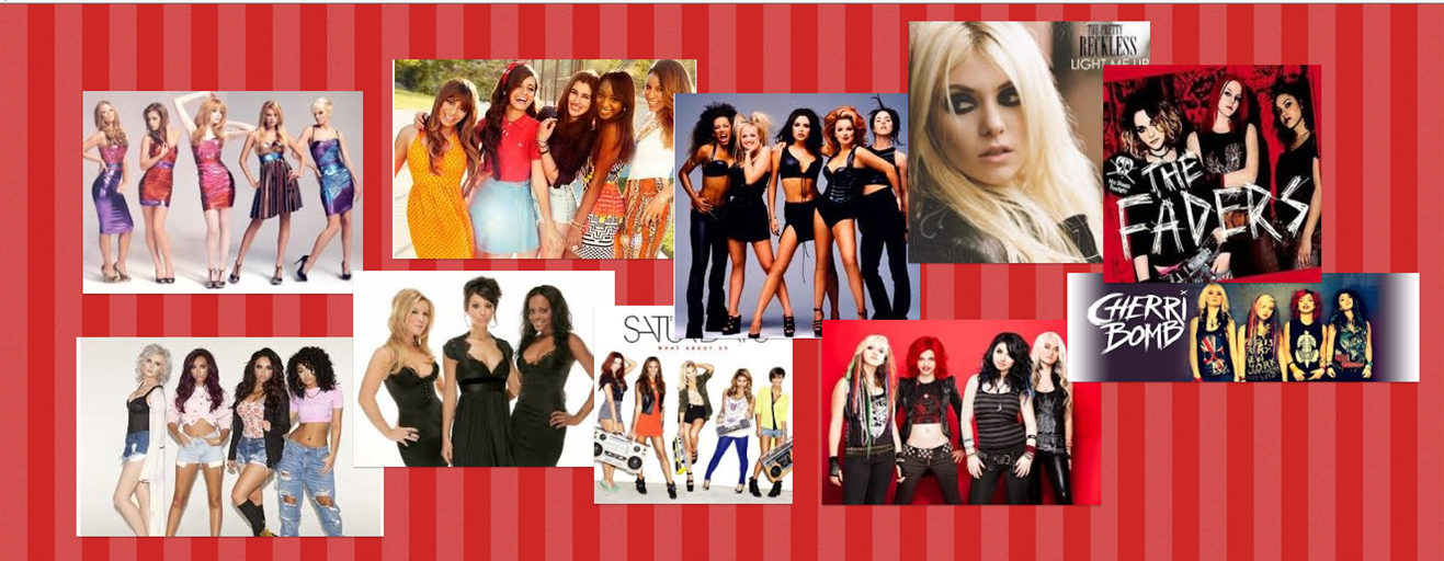
The key idea of parody videos are to entertain the audience either through exaggerated charceterisation or intertextual references. Previously parody videos such as The Wanted's 'Walks Like Rihanna' contains many different intertextual references in order to appeal to their audience. This is done as fans will spot references to other videos so will continue to watch the video to spot this again. These references are key to a successful parody video as it keeps the audience engaged. We wanted to include this aspect in our video. As we were parodying genres we decided to include references to certain bands, cultures and characterisations.
N SYNC-BYE BYE BYE

THE WANTED'S PARODY
Genre
We decided that we wanted to be a conventional girl band but with a rock feel to give us our own individual style/sound in the industry. The industry is filled with traditional girl bands yet we wanted the rock feel to make us stand out. From girl-band inspiration we looked at Little Mix and The Saturdays. They were our main influences when it came to personality, styling and music choices. However, we also looked at rock groups such as 'The Pretty Reckless'. The styling for this band was very dark so created binary opposites from our girl-band research. We used 'The Pretty Reckless' as an influence as we wanted a girl lead grunge band to tie in with our concepts of feminism. Whilst the styling of this band were quite dramatic compare to girl bands such as Little Mix they are still quite minimalistic. Although we were parodying grunge we didn't want to be too over the top as we thought it would ruin the comedic effect so focused our grunge research on the simpler grunge band. Furthermore the sets for the Pretty Reckless videos were minimalistic yet effective. We would be able to emulate similar settings with our limited space and budget whilst still keeping a grungey edge.We incorporated the mannerisms, positioning of girl-bands but used aspects from the rock genre when it came to choosing a song and creating the band's signature styling.

In our media project styling was a very important part as it would help to define our target audience. We had previously looked at the current female performers their costumes and how they appealed to their target audiences. We found that nowadays artists have become more provocative and there are fewer female artists appealing to the 'tween' audiences. Miley Cyrus is a common example that our discussions would come back to. She was previously a classic Disney star that would mainly target 6-13 year olds yet her recent escapades mean that she would now be classed as inappropriate for the younger demographics. Catherine Bennett is a new singer aimed solely at children. After analysing both types of artists and videos we decided that we didn't want to be as extreme as Miley Cyrus as that would make our key demographic very niche, however we didn't want to be as childish as Catherine Bennett as we felt it would deter older audiences. We decided to use conventions from both artists, as well as similar performances, and combine them to make a band that was suitable for 'tweens' as well as appealing to 18-25 year olds.
As far as the styling of our band we needed costumes that would suggest we were for an older market yet not sexualising our image like many of the current girl bands in the charts. We decided from our song that band's music genre is pop with a touch of rock- a genre not really feature in the charts. This new genre meant that we needed to  create a whole new look.


Semiotic analysis


From our research we found that the top ten features of a effective music video are:
  1. Instant impact- within a few seconds the TV guide appears already making the audience question what type of music video it is
  2. Non-Linear editing- We cut the the music throughout. We use discontinuous editing especially at the end of the video to show the TV breaking.
  3. A strong sense of development- The scene changes from just a girl band on TV to all the different genres making up the video and the girl-band eventually breaking the TV screen.  
  4. Strong Sense of artist development- As the new genres are introduced the video keeps going back to ATG showing that they are the focus. Clear unity from the costume/styling along with the signature glitter
  5. An engaging performance- Dynamic and enthusiastic performances in all genres throughout the video
  6. Binary opposites- The genres, outfits, backdrops, lighting and camera movements are all extremes
  7. Visually striking- The different sets connoting different genres
  8. Provoke a reaction- The desire to watch it again to see the different genres
  9. Different layers of meaning- how comical women are rare in the music industry and how this type of video is rarely made by women
  10. References to pop culture-the genres satire all the different genres appealing to a wide group of people.
Our video is an amplification (Goodwin) as we create a new meaning to the song. . Instead of it being about boys wanting to get with girls we changed it to me how the fans will constantly be thing about the 'brand new sassy girl-band' and they will get 'no sleep tonight' as they will always be thinking about us.
Furthermore this is also disjuncture with our video. Whilst the video suggest we are talking to/about boys there are actually no boys at all in the video creating a contradiction between the lyrics and the image.
Our video heavily focuses around postmodernism theories as we take normal representation to parody it. We have deliberately taken texts to expose their nature as constructed texts and make no attempts to pretend that they are 'realistic'. We used post modern theories to relate our video to intertextual references to other music or media/culture that the audience will recognise.
We used Carol Vernallis theory of continuity editing to draw attention to the screen and what is happening. We used broken edits to draw in the viewers attention so that they would become more focused on the band. Furthermore we also used her theory of jump cuts. We used jump cuts continuously throughout the video to create a dynamic a d fast changing video to keep the audience entertained. We cut the video to the beat to reflect the experimental properties of sound.

Album cover
When we were planning our album cover we looked at different artists and the conventions of a typical album cover.
For the album cover we chose to use and develop the conventions of a typical digipack. By going against traditions with this media text it would undermine the product we were trying to sell as it wouldn't be able to full reach our desired target audience. Album covers can full into different categories across the music industry. Our first research task focused around girl-band album covers as they directly related to us.
During our research we noticed that most girl band covers have:

  • Then as the central image- either full length or extreme close up 
  • Their signature colour scheme
  • The bands name central in their specific type face
  • The name above the image of the girls
  • The album name below the artist name
  • The band name was often the biggest focus with album much smaller
  • The girls in similar outfits to show unity

GIRL-BAND ALBUM RESEARCH MOOD BOARD. GIRLS GROUPED TOGETHER WITH THEIR BAND NAME ABOVE THEM.
Whilst our album cover was going to include many of the traditional girl-band digipack conventions we also wanted to stand out to make ours more unique. We looked into the different types of covers. As this was going to be our debut single we decided that we should have a picture of us inside of a cartoon or the bands symbol to make us easily recognisable by the fans.
One layout that we liked the most were the covers with emphasis on name and picture. We thought this was be a good basic layout for our album as it would make us stand out from the other girl-bands as well as clearly defining us as a band.

ARTIST+PICTURE. A SIMPLE DESIGN MAKING THE ARTISTS CLEARLY RECOGNISABLE TO THEIR PRIMARY, SECONDARY AND TERTIARY FAN-BASES.
From our research we found that not many girl-bands had previously done this design this meant our concept was original and would standout in the shops.
One group we noticed often followed this design was The Saturdays. The Saturdays have previously been the focus of our research when defining our band as they follow similar music and styling choices as us. We analysed their previously album cover to look at conventions and how we could use this to develop our idea.

ANALYSE OF ALBUM COVER

DEVELOPING CONVENTIONS 
We needed our album to show a strong and powerful band. We used to the album to create synergy to link all three of our media texts together. We used the same type-face throughout and colour scheme. We found that sticking to a basic colour or texture, glitter for ours, was very effective when creating a band. We got this idea from artist Justin Bieber- although he isn't relatable to our brand through the continuos use of purple in all aspects of his advertising campaign he has created a reliable image that is easily recognisable and can be related back to him.


As for the layout of album cover we used the concept of focus of artist and name. Whilst this layout has been done before it means it is recognisable by the public making them more incline to look at the album. We developed the convention of the 'natural' shoot to incorporate our signature glitter to create a strong brand.  

Main inspiration for the album

WEBSITE 
With the website we stuck to the traditional conventions in order to promote fan purchasing. Most successful websites include:
  • Artist name- the main focus 
  • Picture of the band/artist on the homepage
  • Tour advertisements
  • Tour dates
  • Album purchases
  • Store
  • Links to their Youtube/Vevo page
  • News about the band
  • Biography's about the artist
  • Gallery
  • Links to facebook, twitter, Instagram, Pintrest ect...=INTERACTIVITY
  • QR codes to scan
  • The ability to message/get in contact with the band
We included all these factors in ours. We used the same font type as used in the album cover to create synergy and allow the brand to be easily recognised.


Throughout the website we use interactive marketing techniques to reach the our target market on a variety of different media platforms

Thursday, 23 January 2014

Q2 How effective is the combination of your main product and ancillary texts?

In my opinion I believe that as a group we were extremely effective in our combination of our main product and ancillary texts. We were able to incorporate recurring themes throughout the different products creating a strong brand and band identity. 
Syngery-'the interaction or cooperation of two or more organizations, substances, or other agents to produce a combined effect greater than the sum of their separate effects.'

Our main area of research focused around pop girl bands as they would be targeting the same market as us so would also have similar features and conventions. We focused predominately on new bands on the market as their campaigns would be the most up to date and modern. We chose to focus our main research on Stooshe and Little Mix as we believed that they were the most similar to us with the idea of creating a unique character and personality for each of the girls. Furthermore these two sites had a hevaily focus of social media. We knew that social media was going to be one of the main aspects of our website as that was a way of directly communicating with fans as well as creating a viral campaign.


One of our main sources of research was Stooshe. In many aspects Stooshe is relatively similar to our band as they are mainstream pop but with a touch of R'n'B whilst we are a pop band with a touch of rock. 


Stooshe manage to create a strong brand between them, the website, album and their videos. Common themes run through each individual texts that combine them to them a brand.
 We took different aspect from their marketing to have the same effect. 
In their album, video and website their name is predominant throughout. It has a creative type face making it easily recognisable to their commercial fans. In the videos they also include their name to market to a new audience. 
Furthermore in their 'Love Me' video they also start with a shot of the song name- this may encourage people to look at the album and website in order to purchase the single. 
Bright colours are the main colour scheme of the group. Although there is no specific colour as such the general bright colours and intricate patterns are used to depict the band.
Styling is one of the key synergistic elements used by this band. Whilst they don't all wear similar colours to unite them as a band they all wear different, but recognisable, costumes. Each band member wears different costumes/ outfits throughout the marketing campaign. This allows all the elements to relate to each other.


Slide Show showing different aspects of the website
The Stooshe website is an example of well branded website. The theme of the website along with colouring and type face remain consistent throughout as well as with additional ancillary texts. The white background with black text boxed with splashes a pink creates a simple yet a effectively layout which allows the viewer to easily navigate around the website. The simple layout also allows the girls to stand out more widening their appeal. 
The use of a photo linked with the different girls profiles is an effective way of introducing the audience to the different members of the band. The profiles allow the fans to become closer the girls helping the image of the band. This is also done via the live twitter feed on the homepage and dispersed social media links across the site. By including different forms of social media across the website it allows fans to access the band on many different media platforms. This helps to create buzz around the band through the viral nature of the social marketing websites.
A picture of the girls in the top corner of the server means that the audience will become more familiar with the band as well as creating synergy across the rest of the site.


After remaking Little Mix's debut song last year we felt that this would be a very relevant case study.  
The synergy created in the Little Mix brand is very strong and allows their fan target audience to easily related simple pictures to individual band members. The advertising is simple yet effect. Each girl is given a simple logo which can be easily manufactured. However, these symbols give way to easy mass production of tops, bags ect...The Little mx symbol itself is on all the band's merchandise, videos and their website. The symbol is the first thing that is seen in their debut song 'Wings'. This means that to new fans they are automatically associated with their signature logo
The girls are given individual colours which helps the fans to recognise them easily. The pale colours are typically girly colours allowing them to further reach their target audience. 
The girls also have different individual styles which are heavily exaggerated in order to show different aspects of all the personalities 


From our research we realised that logo and the name of the band were the most important features, in our eyes, to create synergy. We chose our name from the infamous saying 'All that glitters is not gold'. We chose to call our band All That Glitters as it will appeal directly to our primary audience of English teens who will be able to recognise the source of the name. Furthermore the initial name, ATG, gives a catchy feel to the brand an has the potential to become a household name like 1D and JB. 
We needed the design of our name to be interested as that was the half of the focus of our album cover so needed to grab the audiences attention immediately. We used new media technologies, Photoshop, to create our brand typeface. We chose to rotate the R to make us stand out from the crowd. The name appears on every page of the website, twice on the album and at the end of the video. 

Controversially we chose not to have a signature logo as we felt this has become a predictable trend with all new artists. However, with fashion become a bigger part of society we hose to make our look the logo. We incorporated our name into our look to came up with glitter on our faces. The look was simple yet effective. The focus on fashion appeals to one of the qualities we expect our primary audience to hold so makes us appear more desirable. Furthermore it also allows room for clear marketing strategies such as the sale of body glitter. The album name is 'good as gold' with ties in with our constant glitter theme. The positioning in the video, websites, album and photo shows is always Emily in the middle-me on the right- Alicia on the left. We did this so it is easier for the fans to recognise the individual members and have a regular theme running throughout 


Looking back I am please with how we used synergistic marketing strategies to create a strong brand. However in hindsight I felt we could have done more to create a more effective marketing brand like Little Mix. I feel we should have created a brand logo that could be easily mass produced to create a connection between us and our products. In addition we didn't secure a strong colour scheme. Whilst the basic colours were gold, white, black and pink throughout the video and ancillary texts the shades all vary slighting making them feel like separate products rather than a brand. I feel that with the brand we currently own and with the small improvements we would be able to create stronger brand that is easily accessible! 


Wednesday, 22 January 2014

Q3 What have you learnt from your audience feedback?

I believe that the audience feedback was the most valuable part of the evaluation as we were able to reach not only our primary audience but also our secondary and tertiary. We used a multi-platform technique strategy to get different feedback for different types of people. Whilst it was helpful during the evaluation stage it was also useful during the planning and researching stages as it helped to mould and structure our video. 

Research and Planning

We decided that our target audience would be girls aged 14-19. We chose this target group as we felt we could relate to the audience so it would mean we would have insider view on the type of video they would look. Furthermore, after recent event, girls within this age category have less role models to look up to in to the music industry that were not becoming sexually explicit. We wanted to become an inspirational female band that would challenge comical men within the music industry. 
Whilst we knew we want to target girls ages 14-19 we also looked at what these types of girls were interested in. The word cloud above shows some of the types of the things they liked. We used these more in the creating of the artist personality. This makes the artists feel more personal and relatable to the audience.
How do you consume music?


Primary audience interviews


What we learnt from these interviews is that we needed a song that would provide escapism yet still get people excited. However it also helped to structure our band's personalities. We decided to become a band that isn't sexualised and purely focuses on the music. 


When deciding the song we looked at the Top 40 to see the genre breakdown. This gave us an indication us to whether there was a gap in the market of our 'new' genre. 
Pop dominated the top 40 with 20 of the songs being of that genre. This statistic suited us well as it meant that our song could easily fit into the mainstream chart. However, in the top 40 that week there was only one rap song. As our genre was pop with a touch of rap it meant there was very little competition between other rap artist within mainstream music charts
FEEDBACK
 Click here for an enlarge picture to view feedback comments!

What we could have improved on?

  • Remove some of the screen flickering at the end as it was possibly too much? or add more?
  • Show the genres for longer to allow people to register the pop culture references
  • Quieter beeping at the end
  • Add more glitter to our faces!


  • What were learnt from this question was that some people were slightly confused by who the genre of the actual band was. We felt this might be a problem however we feel that with 32/36 knowing the genre was pop was promising. In order to remove any confusion we could in the future so more of us as a band instead of switching between all the genres so much.


  • We very extremely happy with this result. The video was shown to a variety of people meaning that it wasn't going to be to everyones taste. The idea that we scored an average of 9/10 made up feel as though we could expand our primary audience to include a wider array of people.


This video was the final piece of audience feedback that we did. We used this opportunity to ask questions not only about the media products but also about the brand and how strong they though it was.
What have we learnt
Overall from our feedback I think the main thing that I learnt was not to make our target audience too small and niche. We targeted at a relatively niche group so that we would be able to appeal directly to them allowing us to create a more solid fan base. Whilst it was a relatively wide audience I feel that we didn't realise how appealing the video was to boys and older groups. During our branding with the video, website and  album we focused mainly on targeting our primary demographic whilst we should have include more elements which would appeal to our secondary and wider audiences. Without knowing its appeal our brand and ancillary texts were aimed predominately towards girls whereas we could have opened it up. This meant that our appeal could be seen as quite limited. The feedback that we got from this project helped me to realise the wider potential of the band. In retrospect I think doing more audience feedback as we progressed in the project would have been more effective and helpful as we could have seen what appeal to the different demographics. 

Furthermore I feel that I have learnt more about they way music is consumed. Whilst I felt that are video was on example of using music to escape, as it was lighthearted, we could have targeted more the other reasons why people consume music.  The reasoning for why our target audience could have been found through more detailed audience feedback during the project. This could have allowed us to create a more personal connection with the fans through the music video and album. Furthermore by knowing why people listen to different band ands genres and why in particular they may have listened to our song we could have adapted the video to incorporate some of these aspects. This may have created a more personal connection with the fan base creating a stronger and more successful brand.

Whilst I believe that the album cover and website clearly showed that the band was of a pop genre our premier video may have been a bit confusing as to the true identity of the band. Our audience feedback showed that several people were unclear of the true genre of the band. In order to rectify this in the future I believe that we could created a stronger band genre through more conventional pop videos in order to show the band off better as a pop group.

Overall the feedback was extremely useful and in the future can be used to create stronger synergy between the 3 products and the brand! We can use the feedback we received and improve on the three products.

Tuesday, 21 January 2014

Q4 How did you use new media technologies in the construction and research, planning and evaluation stages?

We used a variety of new media technologies to help aid us during the construction, research, planning and evaluation stages in the project.
During the initial stages we used Hypem, iTunes, Youtube and Spotify to try and find a song.After many failed attempts we used web 2.0 to look at the IMDB to look at track lists from famous chick flicks. This is actually where we found our song! This website was extremely useful as it had soundtracks from all the films so we looked at chick flicks as this was our primary audience.
As soon as we started our projection and the groups had been assigned we create a group over the social networking site-Facebook. This was a very positive additions as it allowed us to communicate easily with each other, free of charge, share pictures/ ideas. Although we had weekly meetings in school to discuss our progress with the projects this helped to aid our organisation as we were able to share ideas and thoughts we had outside of school.
Below there are a few pictures from our group on Facebook discussing the project at hand 
We also used to Twitter to communicate picture messages. This was particularly useful during the stages of deciding a logo. We used Adobe Photoshop CS5 to create a variation of logos which we were originally going to project during the ATG performance scenes. We tweeted the different logos to each other to be able to compare them easily outside of school
Web 2.0 was also used when we purchases the boy-band wigs from Amazon and to gather oufits for our girl-band performance and photoshoot


Construction of the video
In my personal opinion the construction and editing of the video is where I was able to use my technological skill that I had learnt over the 2 year course to my advantage to create a professional cut of our video.
For the filming of our video we used a Sony HVR V1E camera. We chose to use this camera as it was autofocus. This made it easier for our free for shots. We liked this camera as it produced good quality film as well as suiting the style of our piece. We also used a Canon 5D to take pictures during the shoot to post on our social media pages and website to excite the fans about our new video1
Before the shoots we had test shoots with the technician. In this time that we had booked we would test the lighting for all the different genres. Getting the correct lighting for each genre was necessary to creating a good satire.
Lighting-The main lighting test that we used was a ARRI Redhead Lights set which was located above the studio. The allowed you to change the brightness of the lights(strength), the colour and which lights were on. We could also manually change the lights. This changed their positioning, where it was flood or spotlight and closing/opening the barn doors. Originally we were going to projection our ATG logo on the screen at the back during the girl band performance. This required us to use a projected to show the image. However, after we reviewed the footage that we had shot we realised it didn't work as well as we wanted it to as the lighting washed us out and logo was too bright. We then arranged a meeting with the technician to review our different options. We tired out different projections but in the end we chose to light it with a simple pink filter.

Simple pink filter/ potential projection

Girl-band
We used the lighting desk to use a pink filter and projected the lights on the a white back drop to give the all pink illusion. We used spotlights to make sure we were well lit. We would grade later to create a stronger/darker pink 
 Country
We used the light desk to use a mixture of orange, yellow and red filters on to the white backdrop to give the warm country feel like in country music videos
 Rap
We used both red and blue filters onto the black filter. We got our lighting inspiration from famous rap videos such as Rack City and 23.
 We used spotlights with this video as well as 4 back lights with the settings P 02 FADER 20. This worked well for the boy-band as it create a dramatic atmosphere like in typical boy-band videos
Grunge
This was simple lighting to create a dark and grungey feel. We only used spotlights to light our face to make the genre more dramatic.


When we reached the post-production and editing stage we used  Adobe Premiere Pro CS5 in order to edit. Many of the techniques that I had learnt, in relation to editing, from AS level came in handy when do the rough cut of our video. However I had to learn how to import images to programme as well as creating the 'TV guide' effect- which was all new to me. We used to the titles effect and copied the virgin TV guide to give the video an authentic feel.


Furthermore as we were creating a music video I was able to test the different effects that came with the programme. We tested various effect but finally chose the 3D effect,ghosting and 4 way spilt to use in the video. Simple shortcuts I had learnt from last year proved to be extremely useful such as the razor tool to cut the film accurately to allow it to fit in time with the music.


This was the first rough cut of our video. This was before we graded shows can easily be compared to the final version!
After we had finished our final cut we graded. Grading fixes the colours and makes them more dramatic. We heavily relied on grading as the sharper colours made the satires feel more authentic. 
We experimented with the brightness and contrast as well as with ProcAmp to adjust the colouring. The video believes how we used the program to grade using the programme. The style we wanted with our grading was just to make all the shots really sharp-as if it was really being shown on a TV. This made it feel voyeuristic as if we were really being watch on TV. The grading, in my opinion, worked best with the country shots as it makes the performance feel very country with the deep warm colours.


 ALBUM COVER CONSTRUCTION


We used www.wix.com to create our band websites. The website allows you to create lively websites that were visually interactive as well providing a lot of interactivity for the target audience. With social networking and new technology driving society nowadays we included many different features to entice the viewers. We included QR codes, links to social networking sites such as Facebook/ twitter and the ability for the fans to directly message the group.We wanted our marketing strategy to be multi-platform to reach audiences on all different levels. To do this we included links to our ATG Facebook page, links to our personal twitters as well as the groups twitter as well as to google accounts. 
We found this server to be very productive however, we occasionally felt restricted with layout s had to adapt our original plans!


Evaluation!
During our evaluation that was a lot of reliance on social networking sites such as Facebook. We created a screening to promote our new bands/videos to gather feedback directly from our target audience.  We promoted the event on Facebook so we could reach all of our school. In addition Premier Pro was used to create a trailer of all the videos in order to drum up excitement.

After the screening we released a survey to get feedback. We used the software- Survey Monkey. We posted the survey online for people to fill out and allow us to get direct feedback from.(results can be seen in question3)
I personally heavily relied on new media technology in the presenting of my evaluation. I used new software such as photo snack and Padlet. They allowed me to present my work creatively for free. This made more blog more interesting to all the readers.